Senior Product Designer - Fintech

Designing systems
that move money
and protect people.

12+ years in fintech, I work where complex regulation meets millions of users who need to trust what they see.

View case studies

I turn regulatory constraints
into user-centered products.

Over a decade designing inside the constraints that make fintech hard: regulation, fraud, scale, and risk. Most of my work involves decisions that do not have a right answer.

Worked with teams at Nubank, Ualá and BBVA, leading design for products used by millions across LATAM.

12+
Years designing financial products
7M+
Users impacted across LATAM
3
Major companies — Nubank, Ualá & BBVA

Three projects.
Three levels of complexity.

01

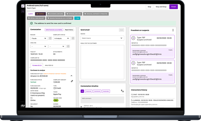
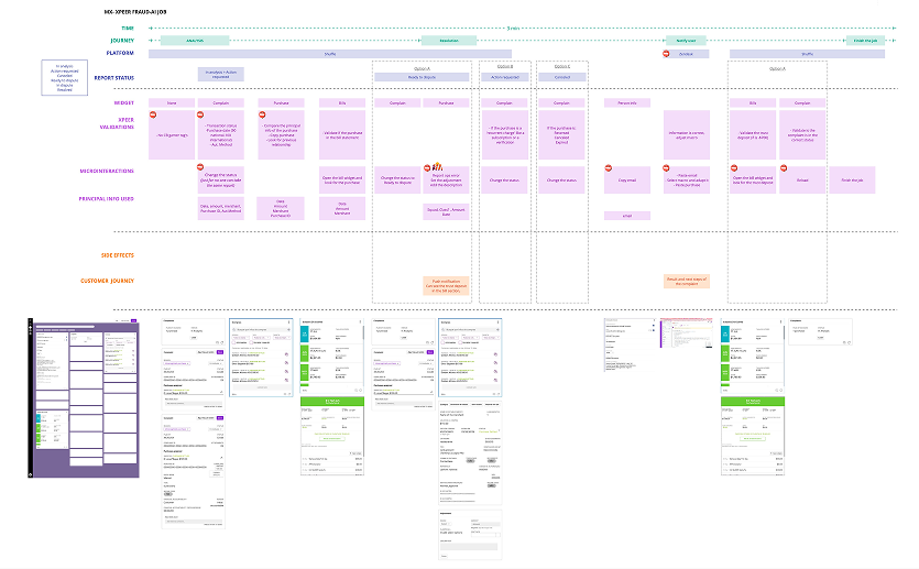
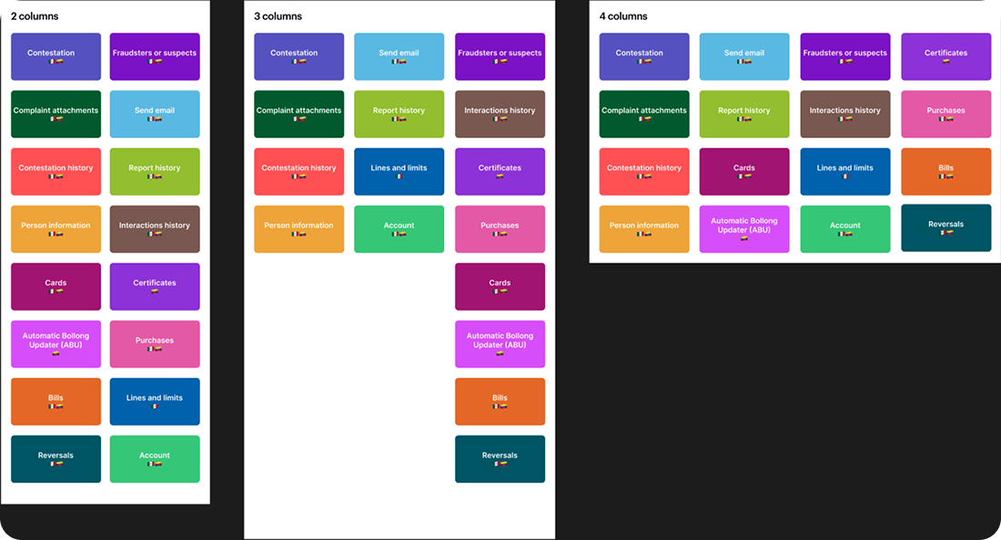
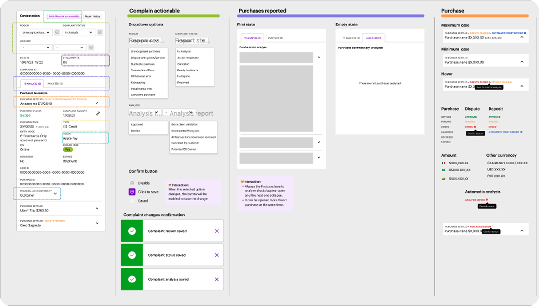
Internal tooling - Fraud Ops - High complexity

Chargebacks Platform

A modular ops platform that reduced fraud agent response times and standardized a fragmented global workflow.

Nubank 80-90 fraud agents
02

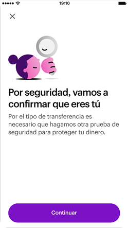
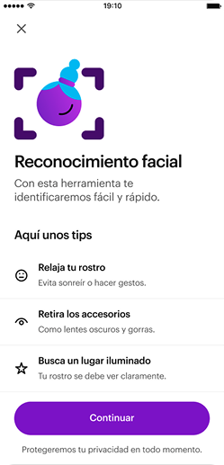
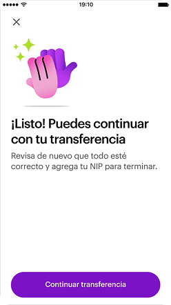
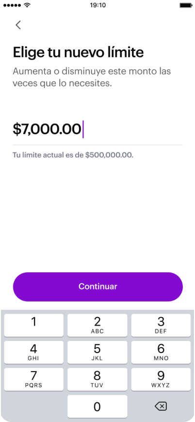
Consumer product - Security - Regulatory

Transfer Limits

A user-facing security flow balancing regulatory compliance with usability. Covers 7M+ users.

Nubank +7 M users
03

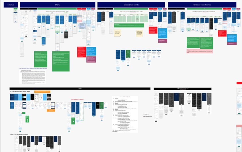
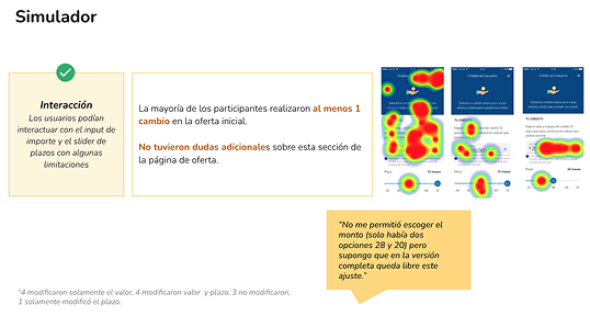
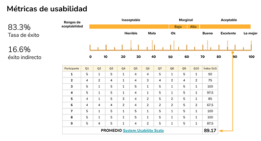
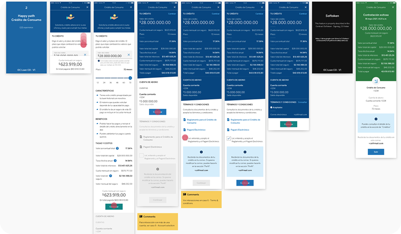
Design systems - Loans - High complexity

Global Loans

A scalable modular loan contracting flow for BBVA adaptable across 5+ LATAM countries. Reduced time-to-market.

BBVA Multi-country LATAM

Let's talk

Open to Senior / Lead Product Designer roles

arantxa.mejia00@gmail.com

Nu

Chargebacks Platform

A modular ops platform that cut agent response times, reduced errors, and brought consistency to a fragmented global fraud workflow without a full redesign.

COMPANYNubank
MY ROLEProduct Designer
USERS80 - 90 fraud chargeback agents
SCOPEInternal ops tooling - Global
Chargebacks Platform on MacBook

Context

When fraud ops cannot keep up with growth

Nubank scaled fast. The fraud and chargeback team did not. Agents were working across multiple disconnected tools, switching context constantly, and manually copying information between systems. At the volume Nubank was handling, small inefficiencies multiply into major operational risk.

This was not just a UX problem: slow resolution times affect customer trust, regulatory compliance, and the business capacity to manage fraud losses at scale.

Problem

Fragmented tools, high cognitive load

Agents needed to access case details, transaction history, customer communications, and resolution options from different places, in a specific order, without a shared workflow structure.

  • High error rate
  • Inconsistent processes
  • Slow resolution

Key insights

What research actually revealed

  • Agents followed a mental workflow that didn't match the tool's structure and they'd developed workarounds
  • The biggest time sink wasn't resolving cases; it was gathering information before making a decision
  • Senior agents were faster not because they worked harder, but because they had pattern recognition built over months
Key insights visual

Solution

A modular platform with centralized information

We identified the reusable information units agents needed — transaction data, customer history, risk signals, communication threads — and rebuilt the interface as a widget-based system.

Each widget could be composed into case-specific views, so different fraud scenarios showed different information in the right order. Navigation friction dropped because agents no longer had to leave their context.

Automation for repetitive steps reducing manual actions.

Solution screenshot

KEY DESIGN DECISION

We chose to improve, not replace. A full redesign would have required months of migration, retraining, and operational risk. Instead, we mapped the existing mental models and evolved the interface to match them reducing adoption friction and shipping faster with lower risk.

Impact

-40%
Reduction in average case resolution time
-60%
Fewer manual data entry errors reported
2
Countries migrated to unified platform

Learnings

The best insight came from shadowing, not surveys. Agents couldn't articulate what slowed them down until I watched it happen

Learnings screenshot

Nu

Transfer Limits

A security-first consumer flow for 7M+ users that balanced regulatory requirements with usability shipped as an MVP on a hard banking license deadline.

COMPANYNubank
MY ROLEProduct Designer
USERS7M+ Nu MX customers
SCOPEConsumer app Mexico

Context

A regulatory requirement, not a product wishlist item

As part of Mexico's regulatory requirements to obtain a banking license, Nu needed to implement transfer security features under a strict deadline, non-compliance would block the license entirely.

The challenge wasn't technical, but experiential: how to introduce a security layer in a product known for its seamless experience without making users feel restricted or under scrutiny.

Problem

Security vs. usability at 7M users

Transfer limits are a blunt instrument. Set them too low: you frustrate legitimate users. Set them too high: you create fraud exposure. The real design problem was giving users control and transparency and not just implementing a limit.

  • Users didn't know limits existed until they hit them — causing frustration and support tickets
  • The adjustment flow needed to be simple enough for low-digital-literacy users
  • Security mechanisms had to feel trustworthy, not punitive
  • Timeline was fixed. Scope had to flex.

Key insights

What shaped the design

  • Transparency before friction: showing the limit before the transfer attempt reduced drop-off
  • The adjustment flow needed to feel like a feature, not a support process
  • It was necessary to use a security mechanism that was already known and highly efficient.
Por seguridad, vamos a confirmar tu identidad Reconocimiento facial Límite. Puedes continuar con la transferencia

Solution

Simple flow, proactive communication

We designed a lightweight, two-part solution: a proactive limit display embedded in the transfer flow, and a self-service adjustment screen that let users request changes with appropriate security verification.

Intro Limite Editar Exito

KEY DESIGN DECISION

We shipped an MVP. There were enhancement ideas on the table like scheduled limits, location-based rules, granular per-recipient settings. We cut all of it. Shipping a clean, compliant, working experience on time was worth more than shipping a feature-rich one late and at risk.

Impact

Shipped on time. Trusted at scale.

Banking license requirement met on deadline
7M+
Users covered from day one

Learnings

Regulatory features are still product features — users don't care about the reason, they care about the experience

BBVA

Global Loans

A modular, reusable loan flow architecture for BBVA that scaled across 5+ LATAM countries reducing time-to-market and eliminating per country design debt.

COMPANYBBVA
MY ROLEProduct Designer
USERS+10M across LATAM
SCOPEConsumer app

Context

One product, five countries, zero consistency

BBVA operates across multiple LATAM markets — each with its own regulatory environment, credit scoring systems, and user expectations. Each country had built its own loan flow independently, leading to fragmented experiences, duplicated design effort, and an impossible-to-maintain product portfolio.

The goal was to unify without homogenizing — build a shared foundation that each country could adapt without breaking the system.

Problem

Fragmentation at the architecture level

This wasn't a visual inconsistency problem. It was a structural one. Flows differed screen by screen, logic by logic. Shipping a new country meant starting from near zero. Updating a step in one country didn't inform any other.

  • No shared design language across countries
  • High time-to-market for new country launches

Key insights

What shaped the architecture

  • Despite regulatory differences, 80% of the loan flow was identical across countries — only specific steps varied
  • Local teams needed control over country-specific steps without being able to break shared components
  • Trust signals (BBVA brand, clear pricing, no hidden fees) had outsized impact on completion rates
Flows architecture overview

Solution

A modular flow system with country-level overrides

  • Core flow modules: offer presentation, deposit account, Terms and Conditions and confirmation
  • Configurable slots: country-specific legal disclosures, identity verification steps, scoring explanations
  • Transparent pricing design: redesigned the offer screen to make rate, term, and total cost legible at a glance
  • Shared component library: co-built with engineering to ensure modules were truly reusable at implementation level

KEY DESIGN DECISION

We prioritized transparency in complex financial products. Where the previous design buried APR and total cost in fine print, the new offer screen led with them. This was a deliberate trade-off: it reduced conversions slightly in short-term tests, but significantly improved product trust and reduced post-disbursement complaints — a better long-term metric.

Collaboration

What this project reinforced

This project was as much about org design as product design. Each country had its own PM and local stakeholders with legitimate needs and opinions. I ran cross-country alignment sessions to identify what was truly universal vs. locally required — and built that distinction into the system itself.

Working with engineering early was non-negotiable. The system only works if the components are genuinely reusable at code level — not just in Figma.

Impact

Less duplication. Faster launches. Better UX.

↓ 60%
Reduction in time-to-market for new country launches
5+
Countries on a single modular system
Improved terms comprehension in user testing
BBVA screenshot 1 BBVA screenshot 2
BBVA full screenshot